SF6 Logo Mocked by Fans for Looking Cheap and Not Fitting the Brand
The announcement of Street Fighter 6 has attracted the attention of gamers for unexpected reasons. The problem is the new logo, which leaves a lot to be desired.

After 24 hours since the announcement of the new Street Fighter game by Capcom Internet users do not spare words of criticism. However, it's not about the game itself, but about its... new logo.
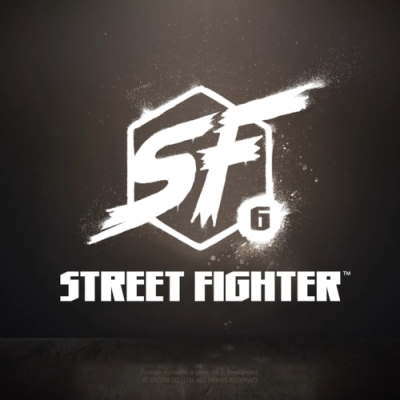
As you can see in the attached image, the logo is not overly sophisticated. It is a hexagon, in the middle of which there is an abbreviation of the game's title. In the bottom right corner, the number 6 is placed in a circular blob.
This simplicity did not appeal to fans. On the r/StreetFighter, a subpage on Reddit dedicated to the SF brand, there were many suggestions that users thought would better serve as a logo for the new title.
Some of these suggest a more interesting font, while others simply go for more vibrant colors that are more associated with the fighting game series.
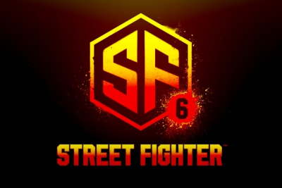
Below is the logo proposed on Reddit by user denz1000.
Here is the logo proposed on Reddit by user Futanarihime.
In addition to serious attempts to show the developers alternatives that would satisfy most players, there are just as many images mocking the developers' lack of effort. Including this parody of SF6's logo on Reddit made by user hoopderscotch.
Reddit user M4g1st0 writes:
"As a designer I feel really bad for Capcom paying good money to whoever "designed" this. A fresh intern could've done way better in probably less time and a with bit more research."
Meanwhile on Twitter user Aurich, who is a graphic designer and a big fan of Street Fighter accuses the creators of using a reworked version of the logo, which can be found in the stock graphics collection of Adobe.
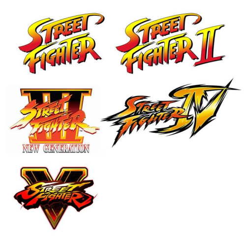
Such a storm erupted around the SF6 logo because it deviates from the standards set by previous installments. Like the graphics in the games themselves, their logos have always been exciting and full of color. It gave the series an identity and a unique and exciting character.
There is a chance that the logo presented during the announcement is temporary. This is not a new practice in the game industry (especially with early announcements of a game in development). This could mean that the logo presented will be changed and Capcom will live up to fan expectations.
However, even if this is only the first version, the graphic theme used by the developers does not fit the brand image created over the years and criticism from the community is justified.

0

Author: Sonia Selerska
Began her professional writing adventure for Gamepressure.com in 2022, but she has always been interested in all forms of the written word. A student of Film and Multimedia with a specialization in Game Design and Development, deeply follows the blurring boundary between these two worlds. Sometimes, embarrassingly, appreciates style over substance. In the case of media, more often than not, goes to extremes; she can never choose between documentaries and horror films, and cozy games, life simulators, and animations. You will find her playing old-school consoles and indie gems rather than AAA titles. Devotes her free time to her love of fashion and art in a broader sense. Believes that the plot is the most crucial element of a game, and the most compelling stories are the ones inspired by everyday life.

Latest News
- Original War: Sand of Siberia now with new mode called Nuclear War
- Someone has remastered Medieval 2: Total War and Rome: Total War so well that the AI's moves are now calculated in a matter of seconds
- 15 years after releease the PC version of Alice: Madness Returns has been fixed by a fan
- Dark Souls 2: SOTFS Ascended Mod RPG with a new version and improved AI
- A free MMO game set in the Fallout universe gets a new version, offering exciting improvements